
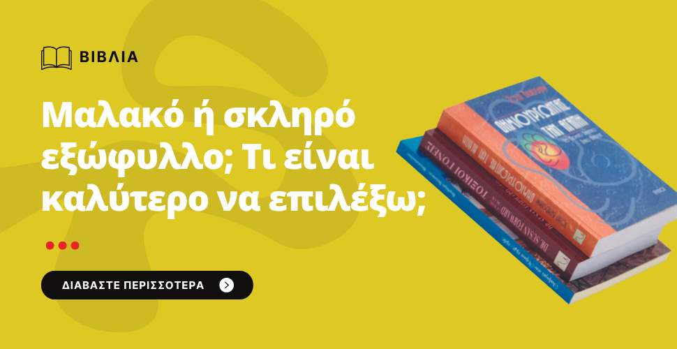
«Μαλακό ή σκληρό εξώφυλλο; Τι είναι καλύτερο να επιλέξω;»
Η επιλογή μεταξύ μαλακού εξωφύλλου (paperback) και σκληρού καλύμματος (hardcover) είναι σημαντική απόφαση στην εκτύπωση ενός βιβλίου και επηρεάζει
• την αισθητική
• το κόστος
• τη λειτουργικότητα
• και την εμπορική ταυτότητα του παραγόμενου έργου.
Ας δούμε τι είναι το καθένα, σε τι διαφέρουν και πότε επιλέγεται το ένα ή το άλλο.
________________________________________
1. Μαλακό εξώφυλλο βιβλίου (Paperback): Χαρακτηριστικά & πλεονεκτήματα
Χαρακτηριστικά:
• Εξώφυλλο από χαρτί 250–350 gsm, με πλαστικοποίηση (ματ ή γυαλιστερή) εάν επιλέξουμε ένα velvet χαρτί εξωφύλλου.
• Εξώφυλλο από χαρτί 250–350 gsm, χωρίς πλαστικοποίηση εάν επιλέξουμε ειδικά χαρτιά εκτύπωσης εξωφύλλου όπως είναι το aquarellio, tintorento, natural evolution, ambergraphic κλπ σε αποχρώσεις τόσο λευκού όσο και ιβουάρ.
• Εκτύπωση εξωφύλλου με ειδική εφαρμογή εξωφύλλου όπως θερμοτυπία, ανάγλυφο, χρυσοτυπία, ασημοτυπία, UV.
• Εύκαμπτο, ελαφρύ, πιο οικονομικό.
• Δέσιμο συνήθως με κολλητή ράχη (βιβλιοδεσία κόλλας).
✔ Πλεονεκτήματα:
• Χαμηλότερο κόστος παραγωγής.
• Ελαφρύτερο και εύκολο στο κράτημα του και στη μεταφορά του.
• Ιδανικό για λογοτεχνία, ποίηση, εκπαιδευτικά, μικρές ή μεγάλες αυτοεκδόσεις.
• Πιο εύκολη αποθήκευση και διανομή.
• Ευέλικτη και προσιτή επιλογή εκτύπωσης είτε τυπώνεται το βιβλίο ψηφιακά είτε offset.
• Χωρίς ανάγκη εκτύπωσης μεγάλου αριθμού βιβλίων.
✔ Μειονεκτήματα:
• Λιγότερο ανθεκτικό (φθείρεται πιο γρήγορα με τη χρήση, κυρίως όταν το εξώφυλλο δεν έχει πλαστικοποιηθεί).
• Δεν αποπνέει "πολυτέλεια" σε σχέση με το σκληρό εξώφυλλο.
✔ Κατάλληλο για:
• Μυθιστορήματα, λογοτεχνικά κείμενα, ποιητικές συλλογές
• Αυτοεκδόσεις
• Εκδόσεις σε μεγάλο τιράζ
• Βιβλία που πωλούνται σε οικονομικότερη τιμή
________________________________________
2. Σκληρό εξώφυλλο βιβλίου (Hardcover): Πότε να το επιλέξεις
Χαρακτηριστικά:
• Εξώφυλλο από χαρτόνι 1,5–2,5 mm, πάχους.
• Το κάλυμμα, μπορεί να είναι είτε με εκτύπωση τετράχρωμη σε χαρτί με πλαστικοποίηση, είτε δερματίνη, είτε πανί, ή ύφασμα με επιλογές χρυσοτυπίας ή ασημοτυπίας).
• εσώφυλλο - ντυμένο με υλικό (π.χ. χαρτί λευκό χωρίς εκτύπωση , τυπωμένο ή ατύπωτο χρωματιστό χαρτί)
• Μπορεί να έχει επένδυση, σχοινάκι/σελιδοδείκτη
• Πιο στιβαρό, δένεται συχνά με ραφή + κόλλα (ραφτοκολλητό).
✔ Πλεονεκτήματα:
• Πολύ πιο ανθεκτικό.
• Αποπνέει πολυτέλεια και ποιότητα.
• Κρατάει στο χρόνο (ιδανικό για δώρα, συλλεκτικά, βιβλιοθήκες).
• Μπορεί να έχει πιο δημιουργικό design.
• Αντέχει στην επίπονη χρήση.
✔ Μειονεκτήματα:
• Πιο ακριβό στην παραγωγή (30–100% πάνω σε σχέση με το μαλακό εξώφυλλο).
• Βαρύτερο, πιο δύσκολο στη μεταφορά.
• Περισσότερος χρόνος για την παραγωγή
• Συνήθως απαιτείται μεγαλύτερος αριθμός εκτύπωσης βιβλίων λόγω παραγωγικής διαδικασίας.
✔ Κατάλληλο για:
• Πολυτελείς ή επετειακές εκδόσεις
• Παιδικά βιβλία (που αντέχουν στη χρήση από τους μικρούς μας φίλους)
• Λευκώματα / φωτογραφικά βιβλία
• Συλλεκτικά ή περιορισμένου τιράζ συγγράμματα
• Βιβλία-δώρα
________________________________________
✔ Σύγκριση σκληρού και μαλακού εξωφύλλου
| Μαλακό εξώφυλλο (Paperback) | Σκληρό κάλυμμα (Hardcover) | |
| Κόστος | Χαμηλό | Υψηλότερο |
| Βάρος | Ελαφρύ | Βαρύ |
| Εντύπωση | Καθημερινή / απλή | Πολυτελής |
| Διανομή | Εύκολη | Πιο δύσκολη / πιο ακριβή |
| Κατάλληλο για | Μαζική κυκλοφορία | Συλλεκτική / πιο ποιοτική έκδοση |
| Χρόνος παραγωγής | Γρήγορος | Πιο αργός |
Ποιο εξώφυλλο να διαλέξω; Συμβουλές ανάλογα τη χρήση
Διάλεξε μαλακό εξώφυλλο αν:
• Θες να εκδόσεις οικονομικά το βιβλίο σου.
• Απευθύνεσαι στο ευρύ κοινό (λογοτεχνία, ποίηση).
• Στόχος είναι η μαζική διανομή ή πώληση μέσω βιβλιοπωλείων.
Διάλεξε σκληρό κάλυμμα αν:
• Θες να δώσεις αίσθηση κύρους και πολυτέλειας.
• Πρόκειται για δώρο, επετειακή ή συλλεκτική έκδοση.
• Το περιεχόμενο είναι καλλιτεχνικό, παιδικό, premium.
________________________________________
Μπορείτε να δείτε δείγματα δουλειάς μας , είτε μέσω της ιστοσελίδας μας https://printhouse.gr/proionta, είτε επισκεπτόμενοι το κατάστημα μας Ναυπλίου 9 και Πέτρας 17 Κολωνός – Αθήνα. Ανάλογα με το τελικό επιθυμητό παραγόμενο αποτέλεσμα, μπορείτε να αποφασίσετε τι τελικά επιθυμείτε να εκτυπώσετε. Είμαστε δίπλα σας σε κάθε εκτυπωτική σας ανάγκη. Πάρτε μια προσφορά συμπληρώνοντας την αντίστοιχη φόρμα https://printhouse.gr/biblia-l... ή μέσω email info@printhouse.gr
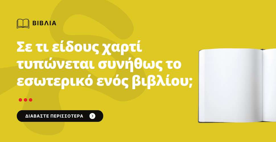
Σε τι είδους χαρτί τυπώνεται συνήθως το εσωτερικό ενός βιβλίου;
Η επιλογή του χαρτιού για το εσωτερικό ενός βιβλίου είναι πολύ σημαντική και εξαρτάται από:
• το είδος του βιβλίου,
• τη χρήση του,
• το αισθητικό ύφος που θέλουμε να αποδώσουμε
• καθώς και το κόστος παραγωγής
Οι πιο συνήθεις επιλογές είναι :
• το bookpaper,
• το γραφής ή σαμουά
• και το velvet (βελούδο ή σατινέ).
Ας δούμε τι είναι το καθένα και πώς επιλέγουμε:
________________________________________
| Τύπος Χαρτιού | Περιγραφή | Πλεονεκτήματα | Συνήθης Χρήση |
| OFFSET Λευκό | Κλασικό, ματ χαρτί χωρίς επίστρωση. Χρώμα λευκό. | Καλή αναγνωσιμότητα, οικονομικό, ιδανικό για πολύ κείμενο. | Μυθιστορήματα, εκπαιδευτικά, δοκίμια. |
| Ivory / (εκρού) σαμουά, bookpaper | Ελαφρώς κιτρινωπό-μπεζ χαρτί. Μαλακό στο μάτι. | Ξεκουράζει την όραση, δίνει “λογοτεχνική” αίσθηση. | Λογοτεχνία, ποίηση, ιστορικά βιβλία. |
| Επικαλυμμένο (coated) ματ velvet ή γυαλιστερό | Λεία επιφάνεια, χρησιμοποιείται κυρίως για εικόνες. | Πολύ καλή απόδοση χρωμάτων και φωτογραφιών. | Πολύ καλή απόδοση χρωμάτων και φωτογραφιών. |
| Ανακυκλωμένο χαρτί | Περιέχει ανακυκλωμένες ίνες, συνήθως πιο σκούρο. | Οικολογική επιλογή, φυσική υφή | Οικολογική επιλογή, φυσική υφή |
Πάχος – Βάρος Χαρτιού (γραμμάρια)
Το χαρτί μετριέται σε gsm (grams per square meter) — όσο πιο μεγάλο το νούμερο, τόσο πιο “παχύ” και “βαρύ”
| Bάρος | Εντύπωση/Χρήση |
| 70–80 gsm | Συνήθως για βιβλία με πολύ κείμενο. Ελαφρύ, οικονομικό. |
| 90–100 gsm | Πιο ποιοτική υφή, λιγότερο “διάφανο”. Ιδανικό για λογοτεχνία. |
| 115–150 gsm | Για βιβλία με πολλές εικόνες ή παιδικά. Δίνει στιβαρότητα. |
Πώς να επιλέξετε το σωστό χαρτί για το βιβλίο σας
1.Αναγνωσιμότητα:
Το εκρού (ivory) χαρτί κουράζει λιγότερο τα μάτια από το λευκό, ειδικά σε μεγάλα κείμενα.
2.Αισθητική & αίσθηση:
Ένα χαρτί με μαλακή, φυσική υφή κάνει το βιβλίο να “φαίνεται” πιο ποιοτικό.
3.Κόστος:
Το απλό offset είναι φθηνότερο από το επικαλυμμένο ή το ειδικό χαρτί.
4.Διάφανο ή όχι:
Αν το χαρτί είναι πολύ λεπτό, “φαίνονται” οι λέξεις της πίσω σελίδας.
Άρα χρειάζεται ισορροπία ανάμεσα σε πάχος και κόστος.
Χαρτί για λογοτεχνικό βιβλίο
Χαρτί: Ivory / Εκρού (σαμουά)
• Ελαφρώς κιτρινωπό, όχι απόλυτα λευκό.
• Ξεκουράζει τα μάτια και δίνει “ζεστή” αίσθηση.
• Θεωρείται πιο “λογοτεχνικό” και αισθητικά ευγενικό.
• Τονίζει καλύτερα το μαύρο της γραμματοσειράς χωρίς έντονη αντίθεση.
⚖️ Βάρος: 80–100 gsm
Το 80 gsm είναι ελαφρύ, οικονομικό και επαρκές για μεγάλα βιβλία.
Το 100 gsm προσφέρει λίγο περισσότερο “σώμα” και δεν διαφαίνεται η πίσω σελίδα — ιδανικό για πιο “ποιοτική” έκδοση.
- Αν το βιβλίο σου έχει πάνω από 300 σελίδες, προτίμησε 80 gsm για να μην βγει πολύ ογκώδες.
- Αν έχει κάτω από 250 σελίδες, 100 gsm θα δείχνει πιο “γεμάτο” και στιβαρό.
- Τύπος: Ματ, μη επικαλυμμένο χαρτί (uncoated)
Δεν έχει γυαλάδα (όπως τα περιοδικά ή οι κατάλογοι).
Δίνει φυσική υφή στο άγγιγμα, πιο “ανθρώπινη” και βιβλιακή.
Η ανάγνωση είναι ξεκούραστη και δεν αντανακλά το φως.
Συνοψίζοντας:
Ivory χαρτί 80–100 gsm, ματ (μη επικαλυμμένο).
✅ Κλασικό και διαχρονικό για λογοτεχνία
✅ Ξεκουράζει την όραση
✅ Κρατά ισορροπία ποιότητας–κόστους
✅ Χρησιμοποιείται ευρέως από εκδοτικούς οίκους
Παρακολουθήστε το σχετικό μας video για το συγκεκριμένο τύπο χαρτιού
Χαρτί για επιστημονικό βιβλίο
Χαρτί: Λευκό (γραφής)
• Το λευκό χαρτί είναι η στάνταρ επιλογή για επιστημονικά, ακαδημαϊκά ή τεχνικά βιβλία.
• Προσφέρει καλύτερη αντίθεση με το μαύρο κείμενο και αναδεικνύει πίνακες, γραφήματα και εικόνες.
• Δίνει πιο “επαγγελματική” και “καθαρή” αίσθηση.
⚖️ Βάρος: 80–100 gsm
Χαρτί 80 gsm: ιδανικό για εκδόσεις με κυρίως κείμενο (π.χ. πανεπιστημιακά συγγράμματα).
Χαρτί 100 gsm: αν περιέχει πολλές εικόνες, διαγράμματα ή πίνακες — αποδίδει καλύτερα το μελάνι και μειώνει τη “διαφάνεια” (bleed-through).
Για πιο “ποιοτική” έκδοση ή βιβλία αναφοράς, 100 gsm είναι η πιο συνηθισμένη επιλογή.
Αν είναι μεγάλο σε όγκο, 80 gsm για πιο ελαφρύ αποτέλεσμα.
Τύπος: Ματ, μη επικαλυμμένο (uncoated) τύπου γραφής ή ελαφρώς επικαλυμμένο ματ
Αν έχεις κυρίως κείμενο, το offset ματ (uncoated) είναι αρκετό — δεν γυαλίζει και είναι πιο οικονομικό.
Συνοψίζοντας:
Λευκό χαρτί 80–100 gsm, ματ ή ελαφρώς ματ επικαλυμμένο.
✅ Καθαρή, επαγγελματική εμφάνιση
✅ Ιδανικό για πίνακες, μαθηματικά, εικόνες
✅ Ανθεκτικό και σταθερό στο χρόνο
✅ Η λευκή απόχρωση βοηθά στην ευκρίνεια γραφημάτων και τύπων
✅ Το ματ φινίρισμα επιτρέπει ευανάγνωστο κείμενο χωρίς αντανακλάσεις
✅ Το βάρος 100 gsm αποφεύγει τη “διάφανη” εκτύπωση και φαίνεται επαγγελματικό
Παρακολουθήστε το σχετικό μας video για το συγκεκριμένο τύπο χαρτιού
Χαρτί για έγχρωμες εκτυπώσεις ή παιδικά βιβλία
• επιχρισμένα χαρτιά με λεία βελούδινη αίσθηση και απαλή επιφάνεια και στις δύο όψεις.
• Συνήθως πιο βαρύ (100,115-130 gr/m²).
• Έχει άριστη χρωματική απόδοση.
• Ιδανικό για φωτογραφίες, illustrations και εντυπωσιακή παρουσίαση.
• Προσδίδει έναν αέρα πολυτέλειας στην έκδοση του βιβλίου.
Αν έχεις πολλές εικόνες, το ματ επικαλυμμένο (coated matte), τύπου velvet δίνει πιο καθαρά χρώματα.
Παρακολουθήστε το σχετικό μας video για το συγκεκριμένο τύπο χαρτιού
Πρακτική σύσταση:
Για λογοτεχνικό ή δοκιμιακό βιβλίο, η πιο συνηθισμένη και ισορροπημένη επιλογή είναι:
Ivory 80–90 gsm (ματ, μη επικαλυμμένο)
✅ Ξεκουράζει το μάτι
✅ Δεν γυαλίζει
✅ Δεν φαίνονται οι πίσω σελίδες
✅ Έχει ωραία “αίσθηση” στο ξεφύλλισμα
Συμπερασματικά:
• Μυθιστόρημα, Δοκίμιο, Ποίηση με εντυπωσιακή παρουσίαση → Bookpaper ή σαμουά
• Λεύκωμα, Εικονογραφημένο παιδικό βιβλίο, Εταιρική έκδοση → Velvet
• Λογοτεχνικά, φροντιστηρίου και πανεπιστημιακά συγγράμματα → Γραφής ή Σαμουά αναλόγως του αποτελέσματος που θέλουμε.
Αναζητάς το ιδανικό χαρτί για το βιβλίο σου; Επικοινώνησε μαζί μας για προσφορά. Κάλεσε μας στο 210 5156300 ή στείλε μας email στο info@printhouse.gr

Ποια είναι η καλύτερη διάσταση για να τυπώσω το βιβλίο μου;
Η καλύτερη διάσταση βιβλίου εξαρτάται από το είδος και το περιεχόμενο.
Συνήθως 14×21 cm για μυθιστόρημα και αρκετό κείμενο.
________________________________________
Η επιλογή της διάστασης (format) για την εκτύπωση ενός βιβλίου είναι κρίσιμη, γιατί επηρεάζει τόσο το κόστος όσο και την αισθητική, αλλά και την αναγνωσιμότητα.
1. Δημοφιλέστερες διαστάσεις βιβλίων
- Μυθιστόρημα/ λογοτεχνία, σχήματος 14χ21 ή 15χ23
κλασικό μέgεθος, άνετο στο διάβασμα και εύκολο στη μεταφορά.
- Ποίηση, σχήματος 13×20 ή 14×21 ή 17χ24
πιο "κομψό μέγεθος", αφήνει ωραία λευκά περιθώρια.
- Δοκίμιο / Επιστημονικό, σχήματος 17×24
μεγαλύτερο, χωρά περισσότερες λέξεις ανά σελίδα, φαίνεται πιο "σοβαρό".
- Παιδικό βιβλίο ορθογώνιο για εικονογράφηση, σχήματος 20×20 ή 21×2
τετράγωνο ή μεγάλο
- Τσέπης (Pocket book), σχήματος 11×17 ή 12×18
Ιδανικό για χαμηλό κόστος και φορητότητα.
Προφανώς και μπορούν να υπάρξουν σχήματα βιβλίων σε custom διαστάσεις, συνήθως με μεγαλύτερο κόστος εκτύπωσης.
Εάν δεν γνωρίζετε ακριβώς πώς να μετατρέψετε το αρχείο που έχετε στην σωστότερη τελική του διάσταση, παρακαλούμε συμπληρώσετε την αντίστοιχη φόρμα για σελιδοποίηση βιβλίου από word αρχείο.
2. Πώς να επιλέξετε τη σωστή διάσταση βιβλίου
✔ Περιεχόμενο & είδος βιβλίου
• Αν έχει πολύ κείμενο, προτιμήστε 14×21 ή 15×23, γιατί ισορροπεί αναγνωσιμότητα και κόστος.
• Αν έχει πολλές εικόνες/πίνακες, επιλέξτε μεγαλύτερη διάσταση (π.χ. 17×24 ή 21×28).
✔ Κόστος εκτύπωσης
• Όσο μεγαλύτερο το βιβλίο, τόσο ακριβότερη η εκτύπωση.
• Οι εκτυπωτές συνήθως έχουν “οικονομικά” μεγέθη που αποδίδουν καλύτερα σε χαρτί Α3 ή Α4 εάν είναι ψηφιακή εκτύπωση ή 61χ86 ή 70χ100 εάν είναι offset εκτύπωση (οπότε 14×21 ή 15×23 είναι πολύ αποδοτικά).
✔ Αναγνωστική εμπειρία
• Οι αναγνώστες έχουν συνηθίσει συγκεκριμένα μεγέθη.
• Ένα μυθιστόρημα 22×30 εκ. μπορεί να φαίνεται παράταιρο.
• Μικρά βιβλία κουράζουν αν η γραμματοσειρά είναι μικρή.
• Πολύ μεγάλα είναι άβολα στο κράτημα.
• Το 14×21 θεωρείται η “χρυσή τομή”.
✔ Αισθητική και στόχευση κοινού
• Αν στοχεύετε σε λογοτεχνικό κοινό, μικρότερο format δείχνει πιο “κλασικό”.
• Αν είναι εκπαιδευτικό ή ακαδημαϊκό, το μεγαλύτερο format φαίνεται πιο “επαγγελματικό”.
Ποια είναι η ιδανική διάσταση βιβλίου:
Καλύτερη γενική επιλογή: 14×21 cm
✅ Ισορροπία κόστους – αισθητικής – αναγνωσιμότητας
✅ Ευέλικτο για τα περισσότερα είδη (μυθιστορήματα, δοκίμια, συλλογές)
✅ Δημοφιλές σε εκδοτικούς οίκους
✅Οικονομικότερος τρόπος συσκευασίας και αποστολής
Tips πριν καταλήξετε
• Ζητήστε να δείτε δείγματα από τον τυπογράφο σας (mockups ή έτοιμα βιβλία).
• Αν κάνετε αυτοέκδοση σκεφτείτε το συνολικό κόστος εκτύπωσης, την κατηγορία του θέματος που ανήκει το βιβλίο σας, το τελικό κόστος που θα κληθείτε να πληρώσετε.
Μπορούμε να συζητήσουμε μαζί πιο είναι το καταλληλότερο σχήμα για την εκτυπωτική και εκδοτική σας προσπάθεια. Θα μας βρείτε στο 210 5156300 ή στείλτε μας το μήνυμα σας στο info@printhouse.gr. Ζητήστε μας προσφορά εκτίμησης κόστους.
Μπορείτε να δείτε το video μας με τις πιο συνηθισμένες διαστάσεις βιβλίων
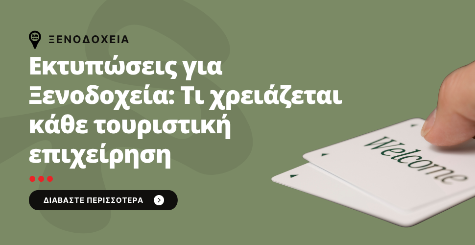
Στον κόσμο του τουρισμού, οι λεπτομέρειες κάνουν τη διαφορά. Οι εκτυπώσεις που χρησιμοποιεί ένα ξενοδοχείο παίζουν καθοριστικό ρόλο στη συνολική εμπειρία του πελάτη – από την υποδοχή μέχρι το check-out.
Οι Εκτυπώσεις που Κανένα Ξενοδοχείο δεν Πρέπει να Παραλείπει
✔ Μενού και Κατάλογοι
Από το πρωινό μέχρι το room service, τα σωστά μενού πρέπει να είναι ανθεκτικά, ευανάγνωστα και κομψά.
✔ Κάρτες Κλειδιού και Θήκες
Αντικείμενα που περνούν καθημερινά από τα χέρια του πελάτη. Ας είναι καλαίσθητα και με ενιαία εικόνα του brand.
✔ Διαφημιστικά έντυπα και έντυπα δωματίου
Discount cards, gift voucher, registration forms, card postal, card with compliments και όλα τα ενημερωτικά έντυπα στα δωμάτια, όλα πρέπει να είναι ξεκάθαρα και επαγγελματικά.
✔ Διαφημιστικά Φυλλάδια
Για προώθηση εσωτερικών υπηρεσιών (spa, γυμναστήριο) ή εξωτερικών συνεργασιών (εκδρομές, τοπικά εστιατόρια).
Γιατί Αξίζει να Επενδύσετε σε Ποιοτικές Εκτυπώσεις
Όταν οι επισκέπτες βλέπουν προσεγμένες εκτυπώσεις, καταλαβαίνουν ότι βρίσκονται σε έναν χώρο που σέβεται τον πελάτη και φροντίζει κάθε λεπτομέρεια. Επιπλέον, η επαγγελματική εικόνα ενισχύει τη φήμη του ξενοδοχείου και αυξάνει τις πιθανότητες για θετικές κριτικές. Δείτε εδώ το σύνολο των εκτυπώσεων που προσφέρουμε για τα ξενοδοχεία.
Συνεργαστείτε με Επαγγελματίες
Επιλέξτε ένα τυπογραφείο που κατανοεί τις ανάγκες του τουριστικού κλάδου, προσφέρει ανθεκτικά υλικά, υψηλή ποιότητα εκτύπωσης και εξατομικευμένες λύσεις. Η εξειδίκευση κάνει τη διαφορά!
Συχνές Ερωτήσεις
● Ποιες εκτυπώσεις χρειάζονται περισσότερο τα boutique ξενοδοχεία;
Τα boutique ξενοδοχεία επενδύουν συχνά σε εξατομικευμένες λεπτομέρειες, όπως προσωποποιημένα welcome cards ή exclusive μενού.
● Πόσο συχνά πρέπει να ανανεώνονται οι εκτυπώσεις;
Τουλάχιστον μία φορά τον χρόνο ή κάθε φορά που αλλάζουν υπηρεσίες, τιμές ή branding.
● Μπορούμε να κάνουμε eco-friendly εκτυπώσεις;
Ναι! Υπάρχουν πολλές επιλογές σε ανακυκλώσιμα χαρτιά και φιλικά προς το περιβάλλον μελάνια.
Η εταιρεία μας είναι στη διάθεσή σας για να σας καθοδηγήσει σε όλα τα παραπάνω. Μπορείτε να δείτε το σχετικό video μας σχετικά με το τι πρέπει να εκτυπώσει ένα ξενοδοχείο
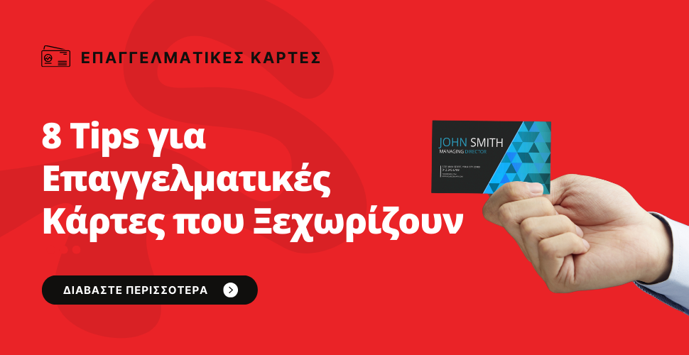
Η επαγγελματική κάρτα δεν είναι απλώς ένα μικρό κομμάτι χαρτί με στοιχεία επικοινωνίας. Είναι η πρώτη εντύπωση που αφήνετε, το μικρό εκείνο μέσο που μιλάει για εσάς όταν εσείς δεν είστε παρόντες. Όσο κι αν οι ψηφιακές επικοινωνίες έχουν κυριαρχήσει, τίποτα δεν μπορεί να αντικαταστήσει τη δύναμη μιας καλοσχεδιασμένης, προσεγμένης επαγγελματικής κάρτας.
Σε αυτόν τον οδηγό, θα εξερευνήσουμε βήμα-βήμα πώς μπορείτε να σχεδιάσετε μια επαγγελματική κάρτα που όχι μόνο θα σας εκπροσωπεί επάξια αλλά και θα σας κάνει να ξεχωρίσετε.
Γιατί Αξίζει να Επενδύσετε σε Μια Καλή Επαγγελματική Κάρτα
Ας το παραδεχτούμε: όλοι κρίνουμε από την πρώτη εντύπωση. Όταν δίνετε την κάρτα σας, στέλνετε το μήνυμα ότι είστε επαγγελματίες, οργανωμένοι και σοβαροί σε αυτό που κάνετε. Μια όχι καλά σχεδιασμένη κάρτα μπορεί να υπονομεύσει το κύρος σας, ενώ μια σωστά σχεδιασμένη κάρτα μπορεί να ανοίξει πόρτες και να κερδίσει τις εντυπώσεις.
Τα Στοιχεία που Δεν Πρέπει να Λείπουν από Καμία Κάρτα
✔ Λογότυπο
Το λογότυπο είναι η ταυτότητα της επιχείρησής σας. Βεβαιωθείτε ότι έχει υψηλή ανάλυση, καθαρά χρώματα και σωστή τοποθέτηση.
✔ Στοιχεία Επικοινωνίας
Όνομα, θέση, τηλέφωνο, email, website, ίσως και τα social media σας. Όμως, προσοχή: μην υπερφορτώνετε το σχέδιο. Κρατήστε μόνο τα απαραίτητα.
✔ Κατάλληλο Χαρτί
Η αίσθηση της κάρτας στα χέρια έχει σημασία. Ματ, γυαλιστερό, ανάγλυφο ή βελούδινο φινίρισμα μπορούν να ανεβάσουν το επίπεδο.
✔ Δυνατός Σχεδιασμός
Το design δεν πρέπει να είναι ούτε υπερβολικό ούτε βαρετό. Σκεφτείτε χρώματα, γραμματοσειρές και σχήματα που εκφράζουν τη φιλοσοφία σας.
Μυστικά για Κάρτες που Κάνουν Εντύπωση
➡ Επιλέξτε Ένα Σχέδιο Που Ταιριάζει στο Κοινό Σας
Είστε δικηγόροι; Προτιμήστε κλασικά, σοβαρά σχέδια. Έχετε δημιουργικό επάγγελμα; Τολμήστε χρώματα και πρωτότυπες μορφές.
➡ Χρησιμοποιήστε και τις Δύο Όψεις
Η πίσω πλευρά της κάρτας συχνά μένει κενή. Γιατί να μην βάλετε ένα μότο, ένα QR code , την κάρτα σας σε άλλη γλώσσα πχ τα αγγλικά εάν αυτό κρίνεται απαραίτητο ή μια επιπλέον πληροφορία εκεί;
➡ Προτιμήστε Κατακόρυφη Κάρτα
Η πλειοψηφία χρησιμοποιεί οριζόντιες κάρτες. Εσείς μπορείτε να ξεχωρίσετε δοκιμάζοντας την κάθετη μορφή.
➡ Επενδύστε σε Ειδικές Τεχνικές
Ανάγλυφο, λαμινάρισμα, UV επίστρωση, soft touch αίσθηση φινιρίσματος – όλα αυτά δίνουν μια αίσθηση πολυτέλειας και ποιότητας.
Αν όμως θέλετε πραγματικά επαγγελματικό αποτέλεσμα, συνεργαστείτε με ένα γραφιστικό γραφείο ή με εμάς όπου μπορούμε να αναλάβουμε τη σχεδίαση της μακέτας σας.
________________________________________
Συχνές Ερωτήσεις
● Πόσο σημαντικό είναι το είδος χαρτιού σε μια επαγγελματική κάρτα;
Το χαρτί είναι το πρώτο που αισθάνεται κάποιος κρατώντας την κάρτα. Ένα καλής ποιότητας χαρτί ενισχύει την αίσθηση πολυτέλειας και προσοχής στη λεπτομέρεια.
● Πρέπει να περιλαμβάνουμε QR code στην κάρτα μας;
Είναι εξαιρετική ιδέα! Ένα QR code μπορεί να οδηγήσει κατευθείαν στο site ή το προφίλ σας, κάνοντας πιο εύκολη τη σύνδεση.
● Τι μέγεθος να επιλέξουμε για την κάρτα;
Το κλασικό μέγεθος είναι 85x55 mm, αλλά αν θέλετε να ξεχωρίσετε, μπορείτε να πειραματιστείτε με τετράγωνα ή κατακόρυφα σχέδια.
● Πόσο συχνά πρέπει να ανανεώνουμε το σχέδιο της κάρτας;
Κάθε φορά που αλλάζουν τα στοιχεία ή η στρατηγική της εταιρείας σας. Αλλά καλό είναι, κάθε 3-5 χρόνια, να ανανεώνετε το design ώστε να συμβαδίζει με τις νέες τάσεις.
● Μπορούμε να σχεδιάσουμε την κάρτα μόνοι μας;
Ναι, αλλά συνήθως το αποτέλεσμα είναι καλύτερο όταν συνεργάζεστε με ειδικούς που ξέρουν πώς να κάνουν τις σωστές σχεδιαστικές επιλογές.
Η επαγγελματική κάρτα είναι το μικρό χαρτάκι που αφήνει μεγάλο αποτύπωμα. Επενδύστε χρόνο, σκέψη και προσοχή σε αυτή, και το αποτέλεσμα θα σας ανταμείψει σε νέες γνωριμίες, συνεργασίες και επαγγελματικές ευκαιρίες. Αν θέλετε βοήθεια στο σχεδιασμό ή την εκτύπωση, εμείς είμαστε εδώ να σας καθοδηγήσουμε!
Πώς να σχεδιάσω ένα έντυπο;

Το αρχείο σας πρέπει να είναι pdf υψηλής ανάλυσης.
Κωδικοποίηση χρωμάτων σε cmyk, όχι σε pantone (εκτύπωση αποκλειστικά σε offset) όχι σε RGB (είναι αποκλειστικά χρώματα οθόνης, έτσι στην εκτύπωση θα έχετε άλλο χρωματικό αποτέλεσμα από αυτό της οθόνης).
Για το εξώφυλλο ενός βιβλίου αλλά και για τα λοιπά έντυπα και κάρτες υπάρχουν τόσο τα απλά (Velvet, Illustration) όσο και τα ειδικά χαρτιά για μονόχρωμες ή για τετράχρωμες εκτυπώσεις όπως πχ. Acquerello Avorio, Acquerello Bianco, Tintorento Guesso, Tintorento Crema και άλλα.
Ενδεικτικά παραθέτουμε λεπτομέρειες ορισμένων:

Κάνετε ηλεκτρονικά αίτηση στην εθνική βιβλιοθήκη προκειμένου να σας χορηγηθεί ο αριθμός του ISBN για το βιβλίο και ο αριθμός ISSN για το περιοδικό. Μόλις ολοκληρωθεί η έκδοση πρέπει να αποστείλετε 4 αντίτυπα του βιβλίου σας δωρεάν στην εθνική βιβλιοθήκη.
Δείτε με προσοχή το σύντομο video που ακολουθεί, καθώς εξηγεί με τρόπο λεπτομερή και συνοπτικό το πώς μπορείτε να πάρετε ISBN για την πρώτη έκδοση του βιβλίου σας.
Πώς να σχεδιάσω μια επαγγελματική κάρτα;
Το pdf πρέπει να είναι υψηλής ανάλυσης
- Σε περίπτωση pdf από Corell οι γραμματοσειρές να μετατρέπονται σε κούρβες (curves).
- Σε περίπτωση pdf από Illustrator οι γραμματοσειρές να μετατρέπονται σε outlines.
- Σε περίπτωση δημιουργίας pdf από Photoshop, το αρχείο είναι πιο σωστό να δουλεύεται στην πραγματική του διάσταση (δηλ. 8χ5εκ. ή 9χ5εκ.), σε ανάλυση στα 300dpi και σε χρωματική σκάλα CMYK και όχι RGB.
Πρόσφατα Άρθρα
- Η εταιρία μας δραστηριοποιείται στο χώρο των εκδόσεων και εκτυπώσεων εδώ και 50 χρόνια. Παρέχει ένα ευρύ φάσμα προϊόντων εκτύπωσης και έντυπης επικοινωνίας για την κάλυψη των ατομικών ή εταιρικών αναγκών σας.
Η ΕΤΑΙΡΕΙΑ
 Αθήνα, Ναυπλίου 9 & Πέτρας 17
 info@printhouse.gr
 +30 210 5156300
 Δευτέρα - Παρασκευή: 9:00 - 17:00
- Βρείτε μας στο Χάρτη
- Αριθμός ΓΕΜΗ 83021902000